

In 1994, the Philadelphia Eagles were purchased by Jeffrey Lurie. A season later, the Eagles redesigned, adopting a stereotypical 1990’s look that coincided with the era’s obsession with teal, and teal-like colors.
The Eagles ditched Kelly Green from their color scheme, the organization’s primary color for approximately 60 years, in favor of Midnight Green.
Fast-forward a couple decades, and Lurie has flirted with the idea of bringing back the Kelly Green uniforms, much to the delight of the Philly faithful. Unfortunately, Lurie would like to do a test run with the Kelly Green as an alternate uniform, which is reasonable but impossible.
The NFL has a unique rule regarding helmets:
Most Eagles fans would agree, it’s time to ditch the Midnight Green and revert back to Kelly Green.
The Midnight Green had a great run with iconic players like Donovan McNabb, Brian Westbrook and Brian Dawkins. Yet as we have seen with several organizations, adhering to fan’s nostalgia is the new trend.
Several teams have ditched their 1990’s/2000’s look, such as the Philadelphia 76ers, Detroit Pistons, Buffalo Sabres, New York Islanders, Buffalo Bills, and Toronto Blue Jays. It’s time for the Eagles to join that list.
The Logos:
The redesigning of the Birds in mid-90’s saw the demise of the full-eagle logo. Instead, they went with a bald eagle head.
![]()
While the current logo is fierce and intimidating, reviving the Kelly Green should coincide with the revival of the full eagle with a football in it’s talons.
![]()
Paying homage to Jeffrey Lurie’s era of Eagles football, I combined the current logo with the 1948 concept, adding more detail to the talons and less detail to the wings/feathers.
Next, the all important script logo, normally found painted in end-zones and on official team merchandise.
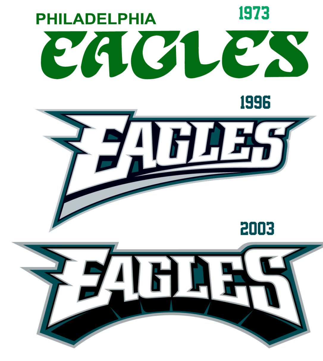
The Eagles had a unique, consistent and iconic font from 1973-1995. While the delivery improved with the switch to Midnight Green, it’s time to revive the old font with a modern twist.
![]()
Combining the old font with the 1996 layout, this new script logo has – once again – a combination of Lurie’s era and the classic look.

Alternate logos are tricky. They can be meaningful to the hardcore fans, they can pay homage to prideful home landmarks, but they can also deviate from the main brand. With the exception of the Celtics’ shamrock logo, most iconic sports franchises do not possess a widely utilized, clearly unique alternate logo.
Having said that, recent redesigning efforts have consistently added alternate logos to their arsenal, if only to sell a few extra t-shirt.

The national symbol in the nation’s birthplace… there should be some homage paid to the great history of Philadelphia.
The Uniforms:
The Eagles have had a variety of uniforms throughout their history. The only constant, starting from 1954, is the presence of the iconic eagle wings on the helmet.

Note that the years listed pertain to when the uniform was first worn, not the year the picture was taken. Additionally, there were several minor alterations made along the way, these were just the unquestionably unique eras of Eagles uniforms, not counting the 1933 Frankfort Yellow Jackets throwbacks that were worn in 2007 for their 75th anniversary celebration.
I elected to primarily revert back to the 1954-1968 uniform set. In 2010, the Eagles wore these uniforms to celebrate the 50th anniversary of their 1960 NFL Championship where they handed Vince Lombardi his only postseason defeat.

In a perfect world, the Eagles would just wear these beauties. However, most re-branding efforts today involve some modernization.
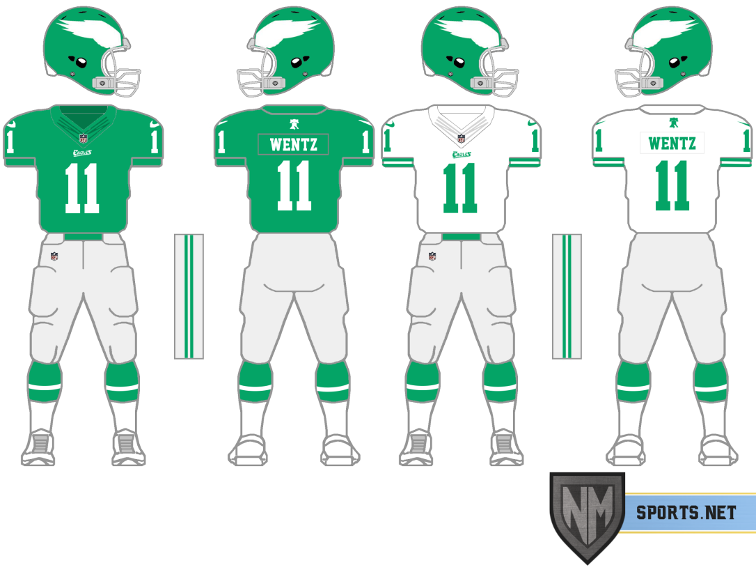
These concepts possess the script logo below the NFL shield, as well as the alternate Liberty Bell logo above the nameplate. While the 1960’s uniforms possessed white pants, I decided to pay homage to the 1974 and 1985 uniform sets with light gray pants. This will contrast the white and Kelly Green jerseys, as well as the Kelly Green socks.


The stripes on the sleeves of the away jersey are an attempt to emulate the stripes the Eagles possessed in the same era.
Conclusion:
The Midnight Green was a fine look, but it should have been ditched upon the conclusion of the Andy Reid era. Consider the Philadelphia 76ers’ uniforms from the late 90’s/early 2000’s:


When you see these uniforms, you immediately recall Allen Iverson: his crossovers, his interviews, his step-over Tyronn Lue. It’s iconic because it is directly associated with a successful era of basketball. A few years removed from Iverson’s departure, the Sixers reverted back to their classic red, white and blue color scheme that was more quintessentially associated with the team’s brand.
Had the Eagles done the same thing, the Midnight green look would effectively be associated with the singular era of Eagles’ football. When you saw the Midnight Green, you would think of Donovan McNabb’s scrambles and Brian Dawkins’ hits.
Instead, it’s been tainted with the likes of Kevin Kolb, Nick Foles, Mark Sanchez, and Sam Bradford.
Making the switch back to Kelly Green is long overdue.

Find me on twitter to give me feedback, as well as suggestions for the next re-branding/redesigning project.
Check out my thoughts on the Big Baller Brand, the LA Rams’ value increase, the Oakland Raiders signing of Marshawn Lynch, and much more.

Great article and take on it. Couldn’t agree more
LikeLiked by 1 person
Man, that is a clean, beautiful, and we’ll thought out design. I love the blend of modern elements with tradition.
I’d like to see them rendered in the yellow/baby blue from the throwbacks just for shiggles.
LikeLike
Many teams change helmets most notable would be the packers throw backs. They have a different helmet so why cant the birds? Maybe its just a really new rule.
LikeLiked by 1 person
The Packers currently remove the decals, but keep the same yellow shell. This is a relatively new rule. The Steelers, Rams, Packers and Redskins all have to keep the same color helmet when they wear throwbacks, despite it’s inaccuracy.
LikeLike
1 helmet rule has been around since 2012. the packers don’t change helmets…they just remove their “G” logo/decal
LikeLiked by 1 person
Nice work, Nick! Love the evolution recommendations!
LikeLiked by 1 person
Very well done! I’m getting ready for the season to start💚
LikeLiked by 1 person
The helmet rule has to get changed along with a new NFL Commissioner
LikeLike