

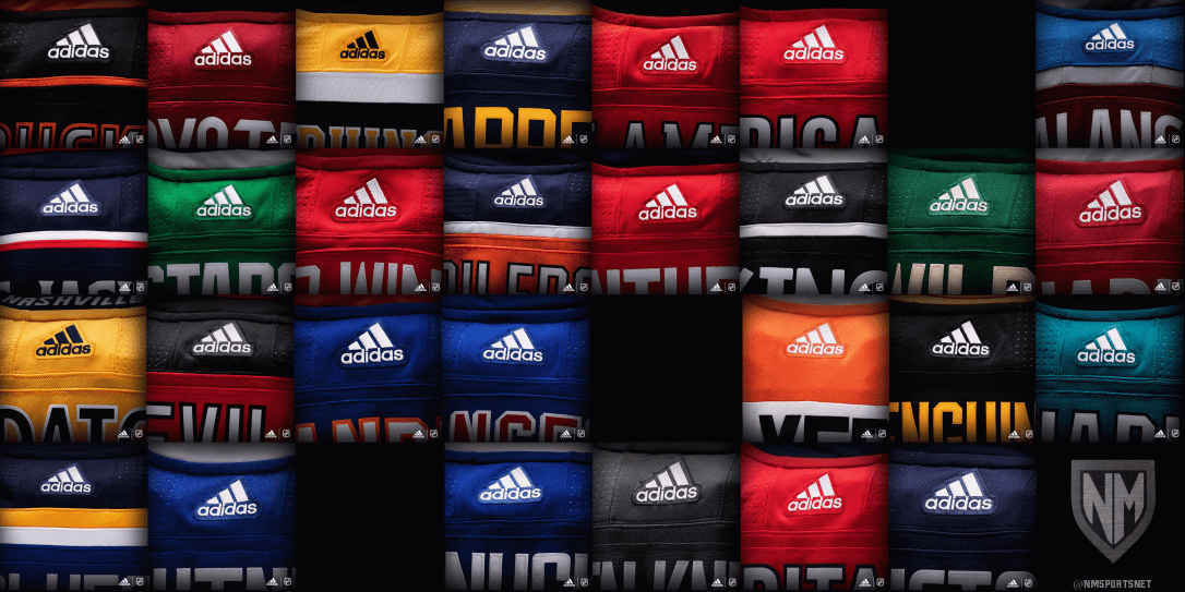
As I eluded to in my Uniform of the Week article yesterday, Adidas has taken over Reebok as the official outfitter of the NHL.
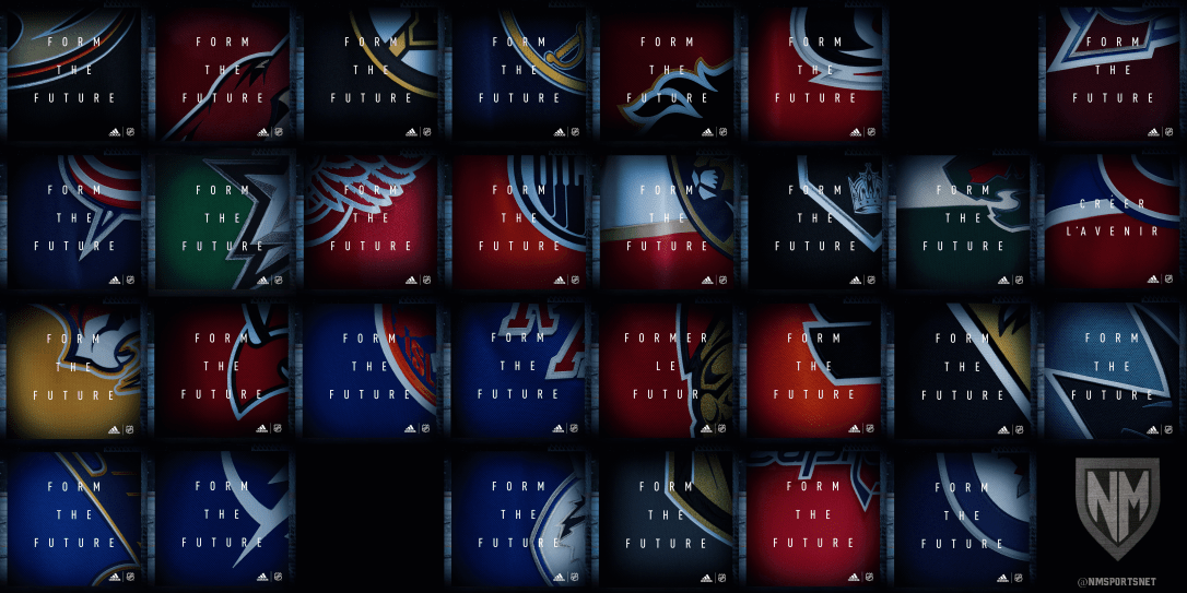
Through social media, teams have released sneak-peaks of the new uniforms that will be unveiled Tuesday, June 20.
As reported by Chris Creamer of SportsLogos.net, 12 teams were expected to receive new uniforms for the 2017-2018 season (not counting the Vegas Golden Knights). These teams included:
- Boston Bruins
- Buffalo Sabres
- Calgary Flames
- Colorado Avalanche
- Columbus Blue Jackets
- Dallas Stars
- Edmonton Oilers
- Florida Panthers
- Minnesota Wild
- Nashville Predators
- New Jersey Devils
- Ottawa Senators
Prior to these quick previews on social media, no one knew for sure just how radically different these uniforms would be, i.e. if they were just touch-ups or complete re-branding initiatives.
Yet with these quick glimpses, we can start making a few assumptions.
Boston Bruins
No one really expected this Original Six organization to make any radical changes. As of now, the only noticeable difference is the font. Where there used to be yellow letters outlined by black and white, now it appears it is simply yellow letters outlined by white – no black.

Buffalo Sabres
The only thing we know for sure regarding the Buffalo Sabres is that they are not making a return to royal blue, much to the fan’s chagrin. And who can blame them:

Calgary Flames
Similarly to the Sabres, we can only conclude that the Flames are not reverting to their old look that disregarded the use of black. While the old look is certainly clean, I am one of the few who isn’t opposed to their current look. Still, these alternates are sharp.

Colorado Avalanche
Major changes were expected for the Colorado Avalanche, who desperately needed to ditch all of the striping and piping of their Reebok uniforms. While their “A” logo and color scheme remain unchanged, we can already identify a change to their shoulder striping.
Columbus Blue Jackets
It appears the Jackets will have new font for their Adidas uniforms. This font resembles the font on their alternate roundel logo.

Dallas Stars
It’s difficult to pick anything out of the quick glimpses that were tweeted out. We can only conclude the the “Victory Green” is here to stay, which I wholeheartedly support.
Edmonton Oilers
The only expected change was a full-time commitment to orange as their home uniforms, which has proven to be true. I’m not a fan of this change, but admittedly… it is still a pretty clean look. Look for the Oilers to add their original blue uniforms back in the mix in the 2018-2019 season when Adidas will allow alternates.
Florida Panthers
The Panthers completely re-branded last season, so there aren’t any radical changes expected. Given the previews, it’s tough to pick out any alterations.
Minnesota Wild
The Wild seem to be making the biggest change, adding a stripe behind their logo à la the Montreal Canadiens.
Nashville Predators
The Predators seem to be ditching a great deal of their piping, especially on the back of their jersey.

New Jersey Devils
The Devils were expected to make big changes. Some hoped for a return to the Christmas color-scheme, but that wish was shot down with these sneak-peaks. One can only hope that they permanently make a return to these beauties one day:

Ottawa Senators
Many Senators fans hoped for a logo change, perhaps back to their old circular seal. It appears their wishes were not granted.
Other Observations
The Flyers appear to be the only team with different jersey material, as pointed out by @TheGoalNet on twitter.
The Red Wings seem to be adding nameplates as opposed to their normal stitching, as pointed out by Paul Lukas.
If there is anything that I missed be sure to tweet me.
Check out my predictions for the Vegas Golden Knights uniforms, as well as my thoughts on the Predators’ success in a nontraditional hockey market, and the NBA’s unprecedented parity concerns.
